(or: "The content of this post is clearly satirical")
Let's take a moment out of our busy day for some cultural appreciation. Specifically, art criticism. We'll look at a classic work by a great, recognized artist, and compare it with a more recent example by another artist working in the same genre.
Now, we could do weeks or months of painstaking research. Or, we could employ a quick and easy technique that seems to be growing in popularity in some circles: the Uninformed Snap Judgment with Side-by-Side Visual Comparison.
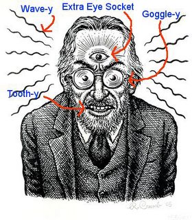
Here, for example are two works. The top picture is by reknowned artist and illustrator R. Crumb, who is generally acknowledged to be the seminal and most prominent figure in the underground comics movement. This master is acclaimed for his distinctive visual style, which is recognized for its critical, satirical and subversive depiction of American culture.
The second work is by some guy from Minnesota. Note the choice of thick, Sharpie-like lines, requiring liberal use of tint to create faux texture (or should that be 'faux liberal use of tint, in place of texture'?), whereas Crumb's technique is more delicate, with thin lines and fine crosshatching.

The Minnesotan also borrowed or, charitably, was inspired by Crumb's thematic symbols: the electric socket performing the same function as a Third Eye, the rounded dental work, the demented stare of the dehumanized and, most noticeably, the radiating waves of--of what? In the Crumb piece those waves create an aura of Anger, an almost purposeful desire by the subject to reach out into the third dimension, grab the viewers by the throat, and subjugate them to the will of who or whatever is controlling him via the Third Eye.
In contrast the other subject is passive, in Receive mode. The waves might be heat, from the data/power cord. Or are they waves of anxiety? Or maybe it's literally radiation; she does look bluish. It's hard to say. And why is it that, of these two zombie characters, the Minnesotan chooses to depict the female as a blank-eyed "mind-slave"? Whereas in the male's eyes Crumb still allowed a glimmer of awareness and purpose (albeit not likely the character's own)?
So what do you think? Is the Minnesota guy ripping off Crumb's style? Or is it derivative, what Hollywood would term an "homage"? Is his work Freudian? Rorschachian?
Or is it just plain "crumb-y"?
gPRT
Ken Avidor is like art--I know it when I see it
Saturday, January 21, 2006
Crumb and Crumber
Posted by
Mr_Grant
at
1/21/2006 02:18:00 PM
![]()
Subscribe to:
Post Comments (Atom)


No comments:
Post a Comment